Canvas Accessibility Tips
Canvas Accessibility Tips From the CTLE
In alignment with our UHD values of cultivating inclusive online learning environments and enhancing student success, this resource provides practical tips to boost accessibility within the Canvas learning management system. You may also access a PDF version of the following information here: Canvas Accessibility Tips from the CTLE.
Canvas Navigation Tips
Implementing Canvas for our UHD Learning Management system represents a proactive step towards enhancing accessibility. The platform’s simplified menu and user-friendly interface enables students to find what they need more efficiently and ensure consistent experience from course to course. However, the design choices you make in structuring your course will significantly impact the accessibility of information and learning for your students.
To improve Course Navigation Accessibility:
![]() Use Modules: Well organized modules can show students what is coming class by class and help
them find materials quickly. You can create a Start Here module and use text headers to tell students where to find general information.
Use Modules: Well organized modules can show students what is coming class by class and help
them find materials quickly. You can create a Start Here module and use text headers to tell students where to find general information.
![]() Use a Page: Use pages within your modules to outline all information your students need for
the week, build content, embed videos, links to assignments, all in one place. You
can link from that page to other elements of Canvas to ease navigation.
Use a Page: Use pages within your modules to outline all information your students need for
the week, build content, embed videos, links to assignments, all in one place. You
can link from that page to other elements of Canvas to ease navigation.
![]() Use Syllabus: This content will guide students on navigating your course. Build your content for
each category or copy from your Word document so the rich content editor can assist
you with accessible content. There is a table-oriented view of the course assignment
schedule, which auto-populates as you create assignments. If you must share a PDF,
let it be a secondary source of the information.
Use Syllabus: This content will guide students on navigating your course. Build your content for
each category or copy from your Word document so the rich content editor can assist
you with accessible content. There is a table-oriented view of the course assignment
schedule, which auto-populates as you create assignments. If you must share a PDF,
let it be a secondary source of the information.
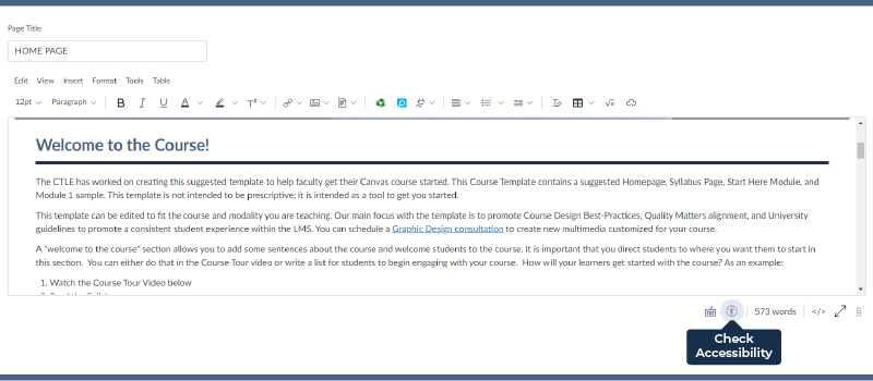
Build directly on Canvas Pages and use the accessibility checker.

Canvas Organization Tips
- Weekly or Unit Modules. Organize modules that reflect the progression of the course are clearly helpful
for students. Describe your course and content structure for students.
- Manage Files. Hide Files that your students don’t need and delete extra copies of files. Make sure PDF documents are selectable, searchable, properly tagged, and in accurate
reading order. Screen readers cannot recognize scanned PDFs. Instead consider linking
to UHD library online versions or accessible online textbook.
- Guide students to Modules. Once you have created well organized modules, you can link from your home page to the modules to help students quickly navigate to this area.
Canvas Communication Tips
Designing your course in accordance with LMS Best Practice Requirements for UHD faculty improves communication accessibility. A homepage featuring a welcome message, contact details, initial course instructions, and clear assignment and grading criteria in the Syllabus offers students a roadmap for starting the course and serves as a handy reference throughout the semester.
To improve your Communication Accessibility:
- Plan your content pages with these questions in mind
- What do my students need to know now?
- Where do they find the information?
- How do they demonstrate their learning?
- Where they need to go next?
Remember, students find it useful when Canvas sites focus on what is most important to them. While they like some attention to design, they are looking for assignments and deadlines. Avoid unnecessary details and remove things that are out of date.
- Transparency
Be clear and transparent about how students will be assessed in their learning. Provide a grading rubric in advance of all assignments and exams. Write clear instructions within the Assignment rich content editor. See Transparent Assignment Template and learn more about the TILT project.
- To Do list and Calendar tools
Set important deadlines as assignments with due dates so that they show up in your students' "to do" list. - Feedback Tools
Take advantage of Rubrics, SpeedGrader multimedia comment tool, and Announcements to provide valuable, timely and specific feedback on their work.
Quick Checks to improve your accessibility score:
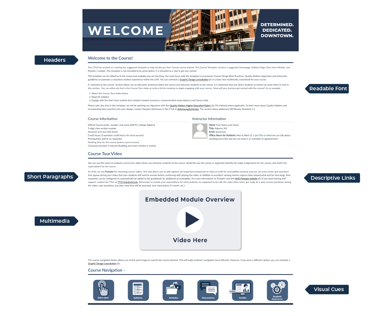
- Page Titles: Each page has a brief, descriptive title distinguishing it from other pages.
- Alt text: All images have alternative appropriate text and alt tags.
- Headings: Heading hierarchy is meaningful and is marked up correctly.
- Descriptive links: Meaningful description helps all users anticipate where a link will take them.
- Readable font: Choose standard fonts with easily recognizable upper- and lower-case characters. Avoid ALL CAPS
- Color contrast: Use 4.5:1 contrast ratio between the text and background
- Multimedia: (video, audio) alternatives Captions, transcripts, and audio descriptions for video/audio content.
For the screenshot add: descriptive links, short paragraphs, important information

To Learn More:
Universal Design for Learning Framework-The CAST UDL Guidelines are a tool that can be applied in any discipline or domain to ensure that all learners are able to access and participate in meaningful, challenging learning opportunities.
Accessible Course Documents- part of the Learning Continuity initiative includes strategies, research and resources on designing accessible course documents
Other Resources: Accessibility Roadmap PDF
