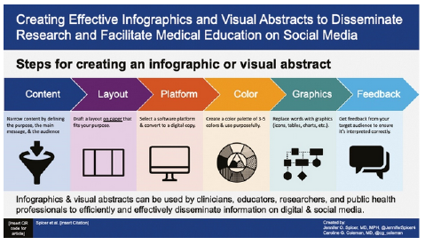
Strategies and Tips
A) Choosing an App:
This section will give an overview of several of the most popular infographic creator
apps:
- Canva
- Venngage
- Piktochart
- Snappa
- Adobe Express
- [Note that there are several other notable infographic/graphic making apps that are
not covered here, but they can become relatively more difficult to use and/or potentially
more expensive. Some examples are: Visme, Infogram, Biteable (video infographics),
Adioma, etc.]
- The first step for any of these resources is to sign up for a free account (Note:
On the Canva site, don’t sign up for “Canva for Education”—this is for K-12

B) Creating an Assignment
Approach #1: Simple Infographic Instructions
- An infographic is a visual representation of factual information and the relationship
between pieces of information. It is supposed to present information in a way that
the reader can easily grasp the key points of the concept and can instantly see how
the concept is relevant to real life.
Student tasks:
- Choose a topic (Note: Either curated by professor or student-driven)
- Use your book and course content to identify accurate and pertinent information on
your topic. Write down the main points you want to convey on your infographic (one
short sentence or bulleted words). Your main points may include:
-
- Define the issue (i.e., Why is it important to wash your hands?).
- Use facts about the issue.
- Use theories from your book to write about the issue.
- Use other interesting facts, processes, or tips that can help people better understand
the issue.
- If your infographic’s purpose is to convey a process, make sure to write down the
steps in order and with the briefest possible description before you choose a template.
- Choose a template from XXXX app that appropriately conveys your information.
- Design an infographic for a general audience. In other words, this should be something
that anyone could read to become better informed on your topic. Infographics have
two parts: CONTENT and DESIGN. Your infographic must be both accurate and visually
appealing.
Approach #2: Formative Assignment
A formative infographic assignment has four basic parts:
- Topic Selection: If topic(s) are curated by faculty, this is not a separate step. If topics are chosen
by students, it is recommended that they be approved by faculty.
- Research/Evaluation: Students do library research and evaluate what they learn for inclusion in an infographic
presentation.
-
- Sources/citations and brief statements of what the student wants to include is submitted
for feedback.
- Feedback centers on: 1) Appropriateness and relevance of sources and 2) Appropriateness
and relevance of information to be included
- Design Phase: The text for each infographic section/topic/blurb and a description of a graphic element
is submitted for feedback.
-
- Feedback centers on: 1) Encouraging specificity and brevity of written information,
2) Alignment of visual elements and written elements, 3) Information presented is
accurate and clear, and 4) Is it true-to-purpose?
- Finalization: Students work on the final version of the infographic. Peer review can also be an
important part of this part of the formative design process for an infographic—it
gives a necessary “third party” view of how the information is presented.
C) Accessibility
- Accessibility can be a particular issue with infographics, as they are often either
saved as images (jpeg or png) or feature an image-heavy design. Screen readers cannot
recognize text within a saved image. Follow these tips to increase accessibility:
- If saving the infographic as an image, include a linked transcript or attach a transcript
at the bottom of the image.
- If possible, save the infographic as a pdf and follow the guidance here (https://helpx.adobe.com/acrobat/using/creating-accessible-pdfs.html) to create accessible pdfs.
- Some additional considerations before saving:
-
- Provide alt text for all images
- Make sure there is clear color contrast between foreground and background colors
- Make sure your organization makes the content readable by screen readers (rather than
visual scanning) in a logical order
- Include clear titles and headers for each section/part
- Keep the font size readable…encourage strong summarization skills rather than more
text with a smaller font size
|
Research
- The combination of both written material and graphics/pictures enhances the probability
that the information will be recalled (Peters & Nordness, 2023).
- Cognitive load theory suggests that infographics that are well-crafted and visually
optimized decrease the load on mental processing, thereby increasing content uptake
(Mayer, 2010).
- Because contemporary education relies heavily on internet searches, it is important
to note that infographics tie in well with social media, which will enhance the relevance
of infographic assignments for students. Infographics have the potential to expand the reach of information far beyond the
originating institution/business, reaching more people and creating more opportunities
for information uptake. The use of visuals to enhance written communication is a well-established principle
in producing effective social media posts (Whadwa et al, 2017; Oska et al., 2020).
|
Resources
Pros and Cons
Canva
Pros:
- Huge array of available templates, many of which are free
- Relatively easy to use
- Free to sign up, with upgrades available
- Many students are already familiar with this app via their K-12 experience
- Great social media layouts
Cons:
- Have to pay for some useful features
- Mobile app not simple to use
Venngage
Pros:
- Easy to use
- A lot of available templates
- Impressive gallery of design ideas
- Free to sign up, with upgrades available
Cons:
- Only five designs for free
- Limited features on basic/free plan
- No mobile app
Piktochart
Pros:
- User interface is very easy to use
- Primary purpose of this app is infographics
- Many sharing options
Cons:
- Free version limited to 5 designs, 100 MB storage, and two downloads
- Prominent watermark with free version
- Only web-based, no mobile app
Snappa
Pros:
- Simple to use
- Free plan has excellent features
- Large gallery of images and templates
- Direct sharing to social media
Cons:
- Very limited customization options
- Only browser-based, no mobile app
Adobe Express
Pros:
- Many free templates
- Simple user interface
- Great social media integration
Cons:
- Substantial watermark with free version
- Best templates require subscription
|
 Digital Tool Infographic
  LC5 - Maintain Active Learning
  LC6 - Provide Flexible Resources
 Quality Matters Alignment:
